Uniting seven Digital NSW branches under a new digital front door
Balanced representation across all seven branches while making heavily nested content easier to find.
Challenge
The Digital NSW website serves as a critical resource for government departments and public servants, providing them with access to information that is directly relevant to their day-to-day work. Recently, we have been receiving feedback from users indicating that they are experiencing difficulties in locating the information they need, the steps outlined on the website are not sufficiently clear, and that the overall organisational structure and hierarchy of the information presented is causing confusion. Meanwhile, stakeholders are asking for a more equal share of the pie.
Goal
Approach
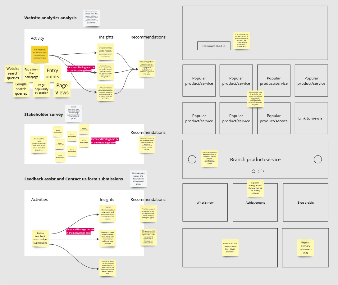
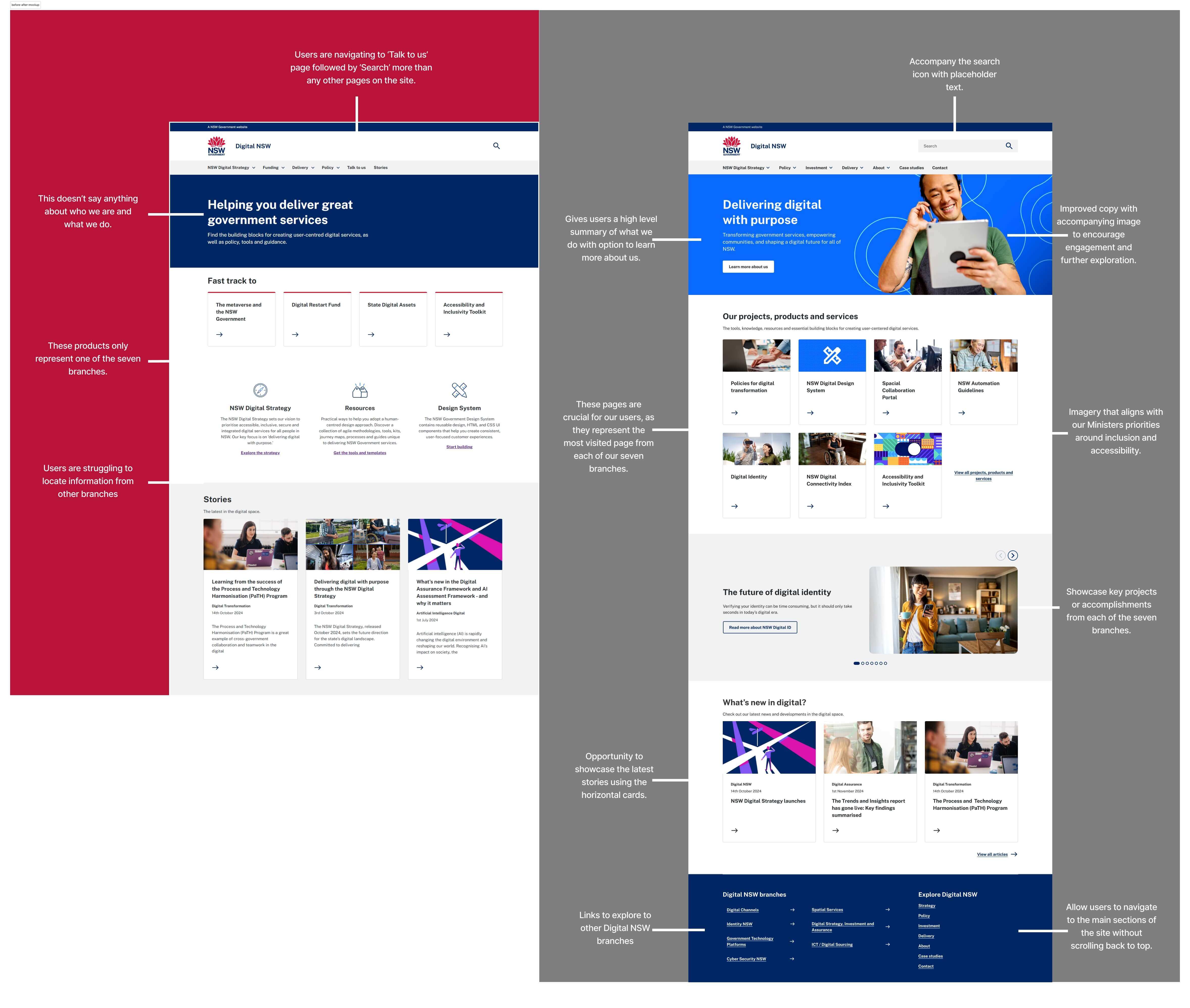
Working with our delivery manager, we evaluated three potential focus areas: a complete site IA restructure, improve the search functionality, and a revamp of the homepage. We selected the homepage as our initial focus due to its high impact potential and relatively low implementation effort.This image has popup zoom functionality - click on it to see it fullscreen:
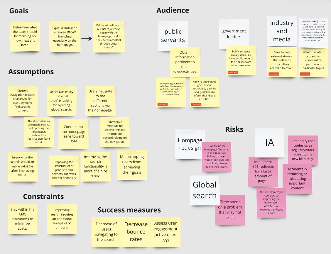
This image has popup zoom functionality - click on it to see it fullscreen:
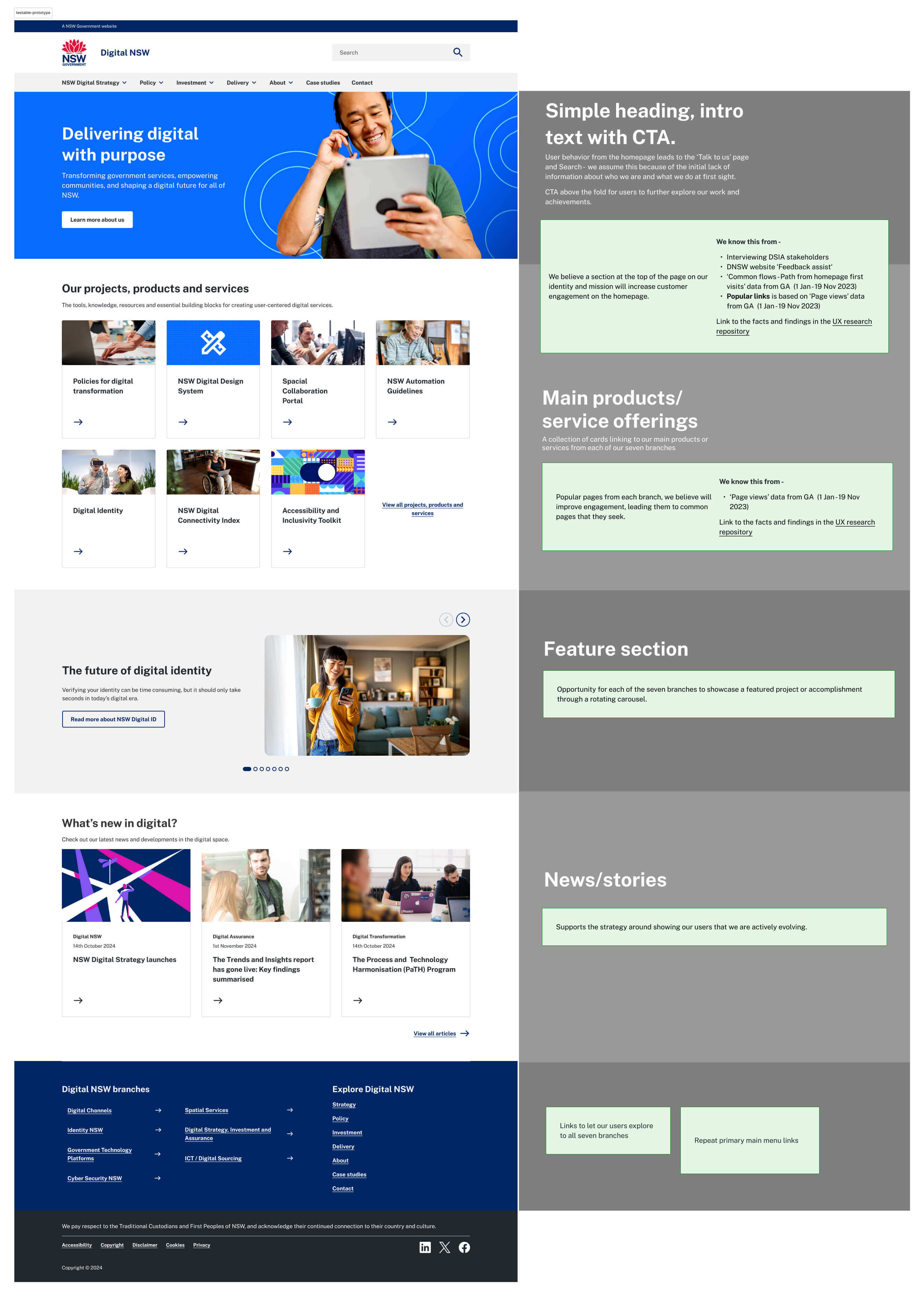
Impact
The key insight from this project was finding balance - between user needs and organisational (government) requirements, between ambition and constraints. Rather than pursuing a complete redesign, we used data analysis to identify high-impact opportunities within our existing framework. This practical approach let us deliver meaningful improvements within our budget and timeline. Moving forward we'll continue to refine and iterate based on the feedback we receive.